
[Note: For background on the "Hoge Brush Company Files" series, click here; to see all the entries in the series so far, click here.]
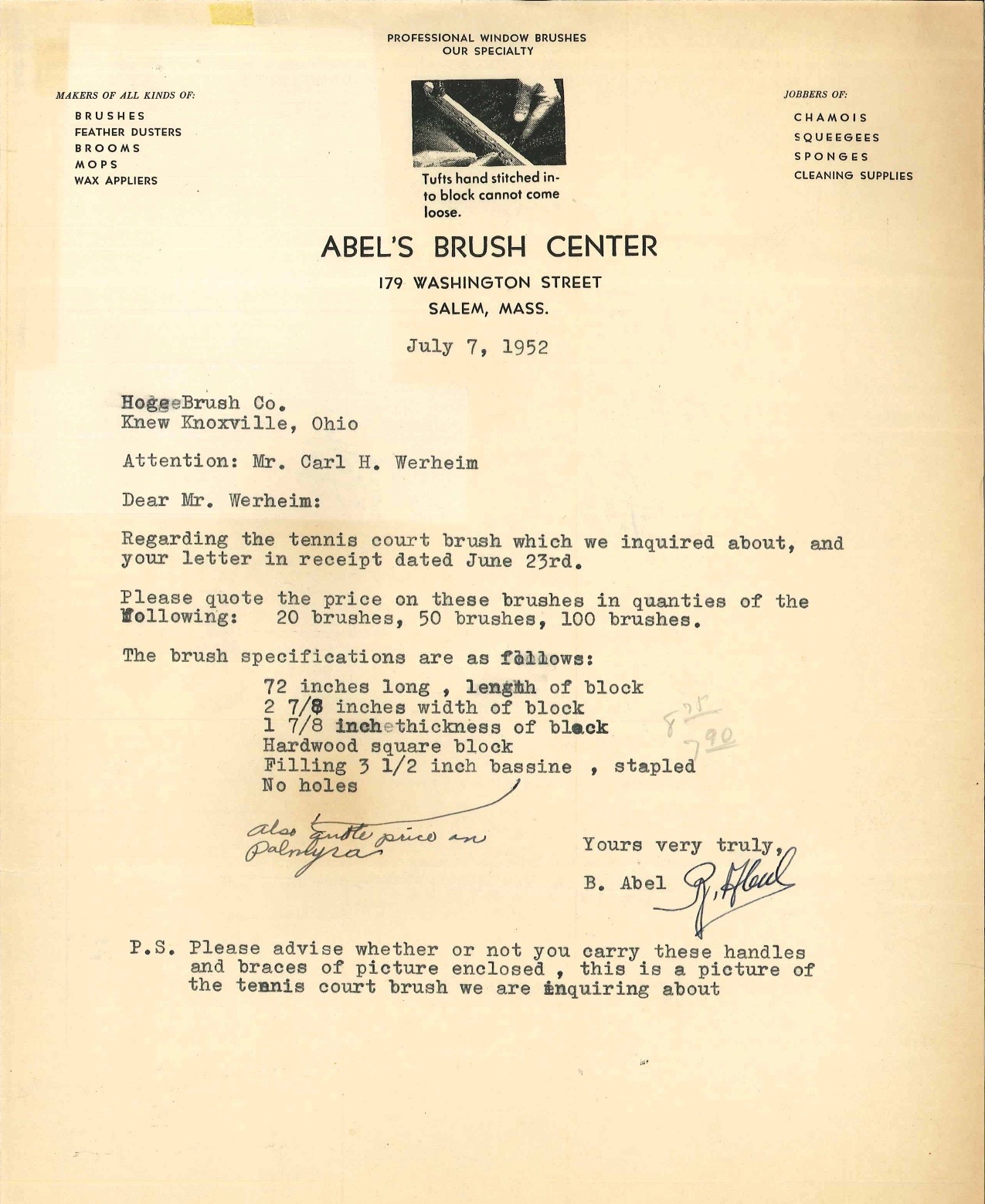
I mentioned in our last entry that I'm a big fan of functional specificity, and that makes a good segue for our latest letter from the files of the Hoge Brush Company, which was sent in 1952 by a Massachusetts concern called Abel's Brush Center.
As you can see, the letter refers to a "tennis court brush," and a note at the end of the letter says there's an enclosed photo of the brush. Sure enough, there was a photo taped to the back of the letter:
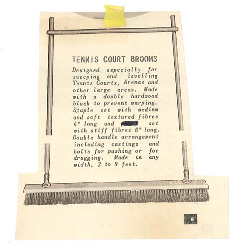
Interesting — and very functionally specific! I'd never seen a broom or brush like this before, so I googled "tennis court broom" and found that the basic design concept hasn't changed much over the past 60-some years:

So there you go — tennis brushes. Who knew?
(My continued thanks to Joanna and David Zwiep for sharing the Hoge Brush Company letters with me.)
Update: In our last entry, I explored the topic of letterhead designs featuring architectural renderings. That prompted a comment from reader Will S, who brings the news that the Columbia University Library has a collection of over 1,300 letters written on stationery designs featuring architectural vignettes. Fantastic stuff — check it out here.
Any idea what the blacked-out word is on the taped-on photo?
ReplyDelete